"Change in context brings changes in the content" - Prof. Anil Gupta


Self-Service Application Journey for Faster Personal Loans
Reducing loan application time for small ticket personal loans
Introduction
Project Overview
Lentra helps financial institutions catering to a wide spectrum of financial services within various loan products launch tech-enabled digital products and services.
I led design for this application during my engagement with YUJ to envision a personal loan application that. helps provide quick small ticket personal loans.
Team
Soumil Panwar (UX Design+Research),
Aditya Lele (PM)
Duration
2 Months
Lentra Personal loan Services
Lentra is a financial services startup building loan application, processing and underwriting products and services for banks and NBFC's. The founders came to us to build their first self service loan application journey for users to scan a QR code and apply for a small sized personal loan by themselves.
User Segmentation to Personalize Application Process
I learnt through research that loan approval time is a function of steps taken to upload and verify financial data of an individual. Post stakeholder discussions, I was able to catagorize loan applicants in three to look at how application times could be reduced for each catagory.
New To Credit (NTC)
New To Bank (NTB)
Existing To Bank (ETB)
Highest risk user
-
First time loan applicants
-
No existing credit history
Most Desirable Customer
-
Applicants with existing credit history with another bank
-
Potential to become new customers for parallel services
Fastest Approval Time
-
Applicants with banka data in the same bank
-
Banks have enough data to pre-approve loans faster
Market Trends
Banking services are transitioning from Agent Assisted to entirely Self Service.
-
Traditional banking services are built on trust
-
Self-service application journeys reduce cost to institutions
90%
business for loan providers comes from agent-assisted loan journeys.
86%
personal loan applications involve heavy to and fro of paperwork with sales agents

How might we design a system with a 100% digital loan application journey as a standard offering (API based) to banking institutions by minimizing time for loan approval and processing
User Insights
Insight 1
Ineffective data collection from customers leads to a lot of to and fro with sales agents and banks.

"
Key Insights:
-
The same information is gathered using multiple documents
-
Human error in application leads to application rejections and loss of time for all stakeholders
-
The complexity of information overload leads to a lot of confusion for the loan applicant
My loan application got rejected because my agent did not enter my income correctly. He forgot to ask for my salary slip and I had to redo the never-ending paperwork."
Rashmi Desai, 28 years
Restaurant Manager
Insight 2
New users lack effective discovery phases in their loan journey leading to conflicted decisionmaking

"
Key Insights:
-
Lack of transparency leaves grey areas customers ignore
-
Poor loan repayment experiences leave trauma
-
Fine print is full of surprises in fines and hidden costs
-
Sales agents are preffered due to possibility for negotiation
1 year after taking a personal loan, I discovered that I have to pay a big fine as 'foreclosure charges' to close my loan faster. I would read terms and conditions well the next time."
Parth Gandhi, 33 years
Business Owner
Synthesizing Opportunities and Framing Design Principles
I was able to collect data from the 12 primary interviews to find connections and draw inferences based on similarities and common patterns. These newly emerged themes helped me chalk out 4 key design pillars for the application and establish UX patterns to abide by.
1 year after taking a personal loan, I discovered that I have to pay a big fine as 'foreclosure charges' to close my own loan faster. I would read the terms and conditions well the next time

01
Aspiration Building
02
Customer Delight
03
Loan Awareness
04
Policy Knowledge
-
Building interest to explore fine print
-
Promoting play-exploration of the forms for brand building
-
Progress validation with easy navigation
-
Digital documentation for recall
-
Info capturing using the camera
-
Comparison of loan terms
-
Clear representation of fine print
-
Making information consumption simple
-
Simplifying loan terms
Application Process Map
Fundamentally, 5 data points are needed to make an approval decision for a personal loan. Challenges lie within validation and authenticity of this information, which brings complexity to the process. I tried breaking this process down from the perspective of financial data for the different user categories and realized that designing efficient use cases for New To Credit (NTC) customers can take care of the rest.

Information Architecture
With clearity of the high-level steps application process, I dove deeper into the granularity of information layout and hierarchy on each screen. This helped me better envision the application flow, use case and layout.

Ideation
I explored multiple ideas for the app touching various directions ranging differently within: ease of implementation vs the possibility of innovation in interaction.

User Testing
I also refined the more meaningful concepts into sacrificial concepts for user testing to narrow down and bring priority.

Virtual Loan Cards
A pre-approved loan card based on the upload of eligibility documents. Users can use this card to get a loan in minutes.

Chatting with Mr Tiger
A chatbot that conversationally helps users to upload documents and apply for a personal loan

Scanning QR to apply
A web application form that users can use anywhere on their mobiles without having to download any app.
Solution
Based on client inputs and concept test learnings, I developed a web app for quick loan offers. Users access it via a QR code, fill a form, and get pre-approvals in minutes. The app streamlines processing by collecting initial data, allowing quick uploads of essential documents, and disbursing funds directly to their bank.
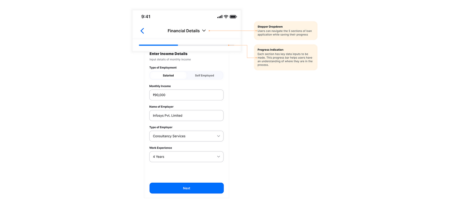
1. Stepper navigation: Making tiring form filling less stressful
The application journey is broken down into 5 stages where each stage progressively collects user data. A visual progress bar along with a stepper indicator makes the 5-stage process quantifiable visually and users have clearity of where they are in the process and what is left.
2. Autofill and data sync: minimizing human error and making underwriting faster
The loan application reads information from existing identification and tax-related documents to synchronize important yet redundant data. From the users standpoint, all they need to do is take pictures of their ID's and the system sutofills sections on the form. In the back end, this data is collected sooner in the process which helpt to initiate automated underwriting processes faster and gives updates on loan decision by the time users complete filling up the form.

3. Autofill and data sync: minimizing human error and making underwriting faster
Lentra wanted users to play with the loan application on their phones in order to build brand awareness. This promotes use cases where people would start an application and come back to it later to complete it. We designed the form in a way that a loan applicant can simply log back into the form and continue their application at their convenience.

4. Doc Checklist: Bringing order in chaotic paperwork
During research, I discovered that people store, use and share different kinds of documents differently. In order to bring organization in documentation, I imagined a checklist that provides users with multiple ways of uploading their information.

5. Clear offer and loan summary: Reducing surprises in fine print
Existing processes of loan application were driven by sales agents and built on relationships and trust. I found out during research that possibilities of negotiating terms of a loan were a fundamental reason users are comfortable with in person applications. We brought the possibilities of negotiating a loan offer and gave freedom for the user to view multiple terms and pick what works for their payment capacities/ schedules

Figma Prototype
Here is the Figma prototype for you to explore and see the happy path of a user applying for a personal loan for the first time by themselves.
Key Learnings
-
The designs received good feedback and were approved by the client. Involving myself on handing off to developers, I learnt about bringing feasibility in designs and the value of using standard components and using a design language
-
I learnt a lot about the work culture of a fast-moving startup.
-
The Indian finance industry has been going through a lot of disruption because of UPI and digitazation of historic record management. Hence, it has a lot of potential for design to come in and play the role of bridging tech innovation and core human needs.
-
It is efficient to talk design with non-design stakeholders using high-fidelity prototypes. Sprints help bring out value progressively and meet business goals effectively.